
Did anyone see Apple’s keynote event announcing the new iPhone 11? Boy oh boy, what about that intro video? It's called "Wonderful Tools", and we couldn't agree more.
We felt brand sensory overload down to our bones and then immediately fell in love. The piece was an artistic mastermind with so much brand power to go with it. So much so, we needed to dissect it in this post.
First off, it’s Apple. And we should expect nothing but the best. But as a creative video marketing agency, when we’re compelled, well, we’re compelled. And we give props when needed.
The thing is explainer videos—especially those with little copy or V/O—require a unique skill set. Plus, only a few motion graphic designers can tackle the power of storytelling through strictly motion.
Clearly there was a creative team behind this video with lots of creative juices flowing. And that's why as video marketers, we focus on the actual video content. The strategy. The messaging. The intent.
So without further ado, here’s our critique.
Let's start with the fact that the video is iconic. Literally.
It celebrated the iconic designs Apple is known for, taking us back in time, jogging our memory as loyalists, and connecting with our senses.
It served as a chronicle of Apple's products over time, recounting the evolution of their user experiences. From a creative perspective, we loved how the video starts with the scroll wheel on the first generation iPod and later transitions to the various home buttons we've learned to deal with.
Eventually, it highlights the fingerprint technology and its beloved Face ID technology transforming how we log into everything. Again, the video screams "innovation in design" and we think it was the best way to open up Apple’s keynote event.
Here are some of the segments we thought were illustrated beautifully:
Iconic evolution in product design
- iMac evolution
- Headphones to AirPods
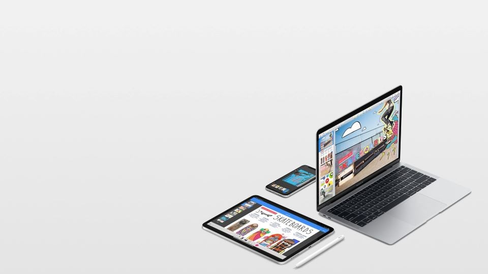
- Macbook Pro
- iPad Pro
- Apple TV
- Apple Watch
Innovation in user experience
- Siri
- Remote
- Home screen button
- Scrolling / swiping
- Camera
Tying lifestyle to user engagement
- Closing the rings
- Vitals detection
- Health app
- Apple watch crown
- Breathe app
Branded sounds
- The success indicator
- How laptops close
- The way AirPods clash with each other
- Camera sound
- Siri sound
- The radar (Find My iPhone)
To wrap up, we tip our hats to the creators of this wonderful video. Brilliant choice of music taking us down memory lane in a mystical journey of innovative design. And of course, just the right amount of copy at the end with a hint of punch to get people excited about Apple's brand purpose. That’s really what video is all about.
Excellent execution and beautifully communicated.